
Natalie is Creative Bloq's staff writer. With an eye for trending topics and a passion for internet culture, she brings you the latest in art and design news. A recent English Literature graduate, Natalie enjoys covering the lighter side of the news and brings a fresh and fun take to her articles.
Whether you're an avid or casual social media user, there's a high chance that you've come across those oversized blob-like characters on your journey through the. This inoffensive illustrative style, often referred to as 'Corporate Memphis', has quickly become the quintessential art style for any brand wishing to appear modern and playful, but in recent years it's fallen out of favour for its formulaic and uninspired design.
The flat 2D illustrations often feature humanoid characters with exaggerated ligaments and minuscule heads, drawn in a basic geometric style. It's an adaptable and transferable design trend that's invaded tech marketing, migrating to the wider world of advertising, regarded as a sort of cheat code to a relatable and fun brand image.
The global grip that Corporate Memphis has on brands has led to an oversaturation of jolly, extreme-appendaged characters that, to me, have become a signifier of desperate soulless pandering. But where did this design plague come from, and how did it develop its soulless reputation? If you want to create more inspiring designs, check out our collection of theWhile the design's origins are uncertain, it's widely regarded that Corporate Memphis originated on Facebook .
The flat appearance of Corporate Memphis lends to its easy recreation, requiring less technical capability than skeuomorphic design. With little to no dynamic shading, bold geometric character design and adaptable skin tones that represent a diverse audience, it could be copied and pasted to fit whatever marketing scheme required – modern enough to feel fresh, but indistinct enough to be universal.
As we look into the future, it seems that the invasion of the large-limbed pastel people may finally be ceasing, as brands such asreject the outdated style. Corporate Memphis has become so infamous that it's now used as a form of parody, rather than a trendy brand identity. With trend cycles rapidly renewing it's clear that there's no comfortable place to settle in design, but for now, I'm glad to see Corporate Memphis laid to rest.
日本 最新ニュース, 日本 見出し
Similar News:他のニュース ソースから収集した、これに似たニュース記事を読むこともできます。
 Police worker with very dodgy friends betrayed world's biggest investigationNatalie Mottram has now been jailed after tipping off criminals about EncroChat
続きを読む »
 Maine considers giving the boot to corporate electric utilitiesMainers are poised to vote Tuesdya on an unprecedented plan to rid themselves of the state's two largest electric utilities and start with a clean slate.
続きを読む »
 Sheffield United's Paul Heckingbottom says 'unforgiving' pressure part of management's appealPaul Heckingbottom says the unforgiving nature of football management is why he enjoys it.
続きを読む »
 How to manage teams in a world designed for individualsIf collaboration matters so much, why don’t firms do more to promote it?
続きを読む »
 Russian strike claims 19 lives in attack on Ukraine military awards ceremonyDefence minister Rustem Umerov has ordered an investigation into why such a crowded event was held.
続きを読む »
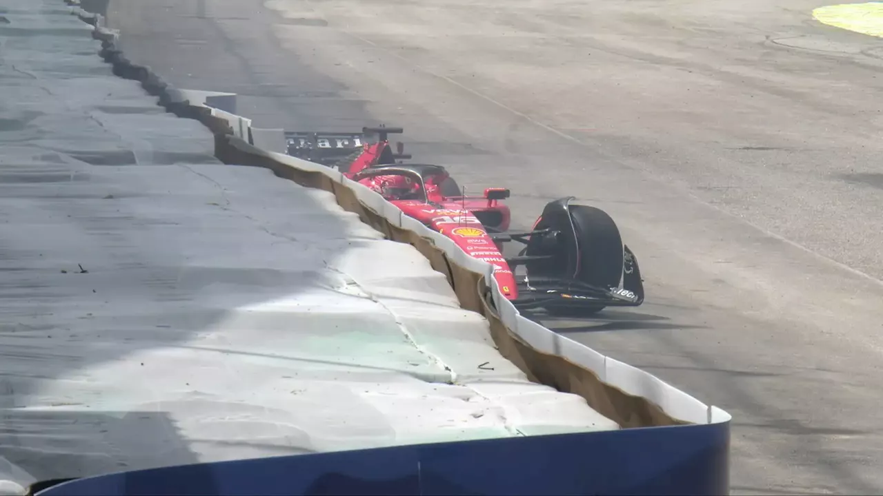 Ferrari disaster as Charles Leclerc crashes out on Brazilian GP formation lap'Why the f*ck am I so unlucky!''
続きを読む »