Is this the most Canadian logo ever?
Space is often described as the final frontier, and it's certainly proved to be a challenge for logo design. We've seen all manner of space-related logo controversies over the years, from SpaceX's wonky NASA logo to the much-mocked US Space Force designs.
The Canadian Space Agency's new logo is intended to communicate 'daring invention and our sights set on the future, ready to push the boundaries of ingenuity and innovation." Or maybe it just shows a maple leaf being launched into space. Either way, the design that will be worn on the suit of the first Canadian astronaut to launch to the moon with NASA's next Artemis mission is a lot cleaner than the agency's previous effort.
日本 最新ニュース, 日本 見出し
Similar News:他のニュース ソースから収集した、これに似たニュース記事を読むこともできます。
 The 10 best scheme fits from the first wave of NFL free agencyThis NFL free agency period, teams did a good job of filling needs without grossly overpaying. FB_FilmAnalysis on his 10 favorite scheme fits from free agency so far, including Jakobi Meyers to the Raiders and Charles Omenihu to the Chiefs.
続きを読む »
 Zack Snyder says his upcoming Netflix space epic Rebel Moon is getting an RPG | VGCFilmmaker Zack Snyder says his upcoming Netflix space epic Rebel Moon will be getting an RPG spin-off which will have a 'ridiculous scale'.
続きを読む »
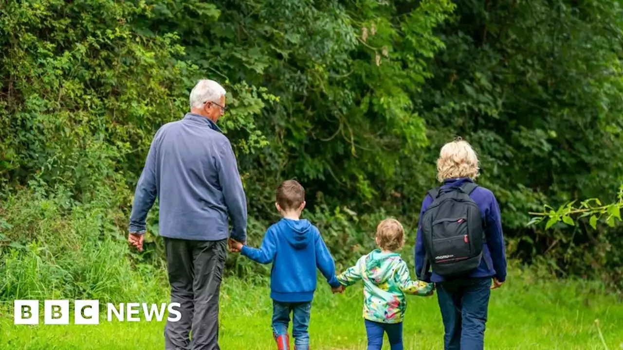 Climate anxiety linked to lack of access to green spaceA Woodland Trust poll finds seven out of 10 young people say they are worried about climate change.
続きを読む »
 Opening date announced for popular food chain in revamped Odyssey complexIt is one of three restaurants set to open in the transformed space
続きを読む »